Nearly 70% of homeowners say painting kitchen cabinets is the biggest visual return. It beats new appliances or countertops. The right colors can make a big impact without a full renovation.

This guide offers practical kitchen paint color ideas for South African homes. You’ll find everything from timeless off-whites to deep green. We mix tested brands like Benjamin Moore Advance with reliable Behr options and hands-on advice.
Think of cabinet color as the scheme’s backbone. It sets mood, defines space, and affects resale value. You’ll learn how to pair colors with countertops and wood tones. Plus, which finishes last in busy homes and what pros use for a smooth finish.
Before choosing a shade, think about durability. High-quality paints like Benjamin Moore’s Advance or Behr Cabinet Enamel are best. They offer cleaner lines and easier upkeep than cheap paints. With the right prep and finish, your cabinets will look new for years.
Why choosing the best paint colors for cabinets transforms your kitchen
Choosing the right cabinet color does more than just change how your kitchen looks. It sets the mood, connects materials, and guides design choices that catch buyers’ eyes. Opt for a well-thought-out cabinet paint color to enhance your daily use and boost resale value.
How cabinet color changes affect kitchen feel and resale value
Light colors like creamy whites open up spaces and brighten them under South African sun. Dark shades, such as Hale Navy or Black Tar, add elegance and luxury to bigger kitchens. Experts say that thoughtful cabinet colors can influence buyers, so pick colors that fit your market and kitchen size.
Design impact: light, depth and perceived space with color choice
Color plays a big role in how light interacts with your kitchen. Light paints reflect light, making small kitchens appear larger. Dark colors absorb light, adding depth, which is great for islands or lower cabinets. Use contrasting colors to create zones and guide the eye without cluttering the space.
Why paint and finish matter as much as hue (durability, cleanability)
Paint finishes affect how well they last and how easy they are to clean. Benjamin Moore’s Advance and Sherwin‑Williams urethane trims show the value of finishes like semi-gloss or pearl for high-traffic areas. The right finish resists stains, hides fingerprints, and extends your cabinets’ life.
- Choose durable products for busy households to avoid early chipping.
- Match sheen to use: satin or pearl for panels, semi-gloss for trims and edges.
- Test cabinet paint color on-site to judge undertones in your lighting.
Timeless white and off-white cabinet color ideas for a bright kitchen
Choosing white paint for your cabinets makes your kitchen feel clean and airy. It’s perfect for many kitchen styles. It also brightens small spaces and appeals to those who love classic looks.

Popular whites include Cloud Cover, Simply White, Swiss Coffee, and Creamy White. These options from Benjamin Moore offer slight differences. Cloud Cover is crisp but not stark. Simply White is warm and versatile. Swiss Coffee adds a soft creaminess. Creamy White is great for adding warmth.
Finish pairings
- Eggshell or matte on walls with pearl or semi-gloss on cabinets keeps contrast subtle and practical.
- Eggshell walls + pearl cabinets create gentle sheen and easy cleaning for daily use.
- Pearl walls + semi-gloss cabinets boost reflectivity in low-light kitchens.
- Matte walls + high-gloss cabinets deliver modern drama, though matte walls need gentler care.
White cabinets go well with many countertop and backsplash choices. For a monochrome look, match cabinets with marble or white quartz. This creates an all-white kitchen that feels expansive. Adding warm wood counters or taupe backsplashes adds depth and prevents the room from feeling flat.
You can anchor a mostly white scheme with a bold island or colourful backsplash. This keeps the main cabinetry timeless while letting you introduce trend-led accents. Use a quality primer and waterborne alkyd or urethane-modified enamel. This ensures your white paint resists yellowing and cleans easily over time.
Neutral cabinet color ideas for a calm, versatile kitchen
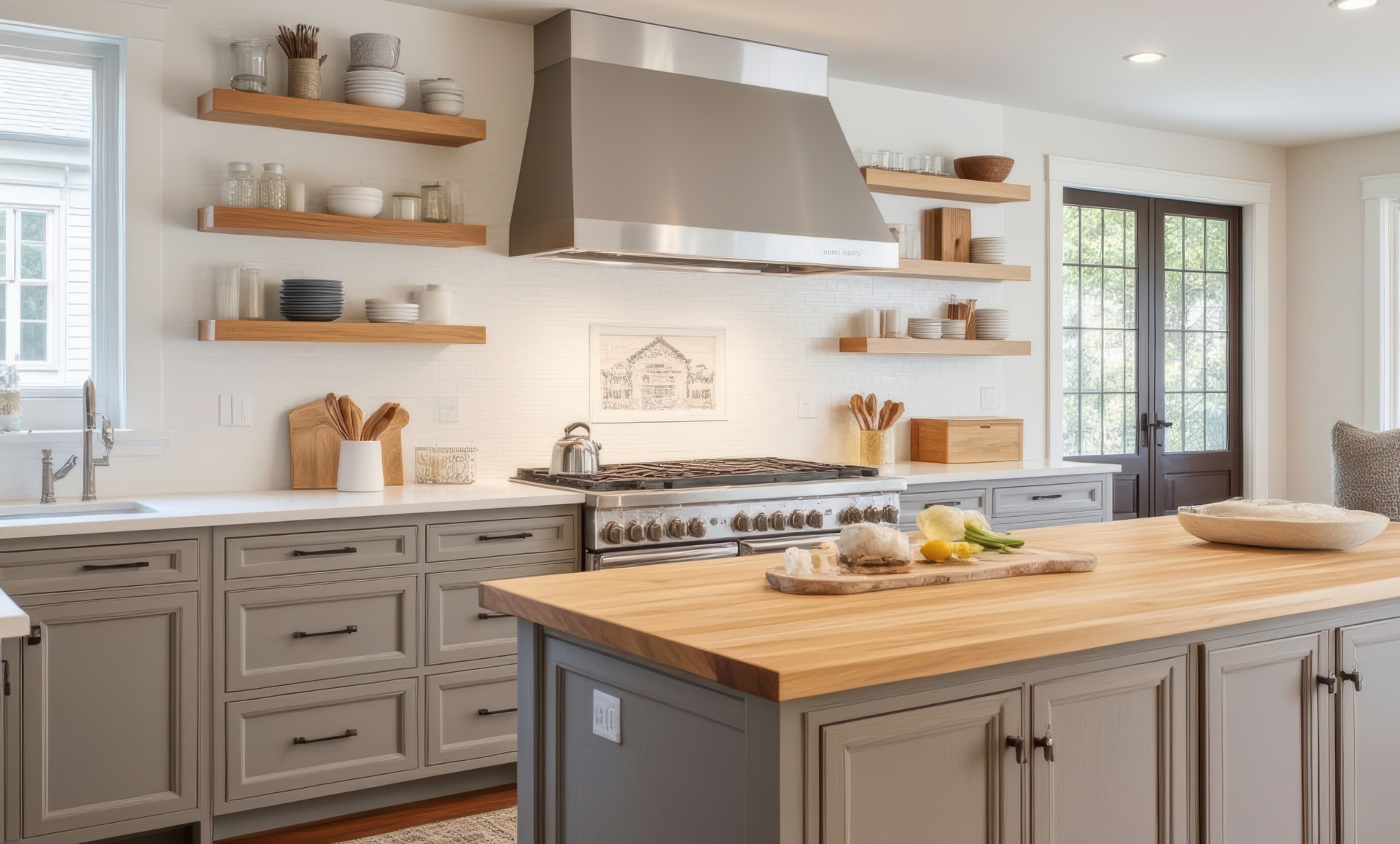
Opt for a neutral palette for a kitchen that’s both calm and adaptable. Warm greige tones like Accessible Beige and Coastal Path offer a soft background. They complement both modern and traditional designs, aging well and boosting resale value.
Greige mixes gray and beige for a balanced warmth. Accessible Beige by Sherwin-Williams has a gentle, sunlit feel that matches mid-tone wood floors. Coastal Path AF-380 is slightly cooler, perfect with marble or light quartz for a sophisticated look.
Pairing neutrals with countertops and flooring
Pair warm neutrals with warm stone or engineered quartz for a unified look. Cool greige works well with cooler countertops and lighter floors. Studio McGee recommends neutrals like Accessible Beige and Natural Tan for their versatility with different floors and countertops.
Using neutral cabinets to highlight an island or bold accent color
- Use neutral cabinets to make an island in navy or forest green stand out.
- Neutral upper cabinets and a painted island create a timeless two-tone look.
- Add natural wood shelving and brass or matte black hardware for texture without overwhelming the space.
Choose semi-gloss or pearl sheens for easy cleaning. Use professional-grade primers and paints to avoid tackiness and chipping. These steps ensure your neutral choices remain fresh and durable in busy kitchens.
Bold and dramatic cabinet colors: navy, dark green and black

Dark cabinet colors add drama to your kitchen. They can anchor a room, contrast with pale walls, and make your kitchen feel luxurious.
Navy and Hale Navy offer a classic yet modern look. Navy blue pairs well with marble or light quartz counters. It also looks great with brass or matte black hardware for a timeless feel.
Dark green adds warmth and coziness. Benjamin Moore offers options like Balsam and Newburg Green that are rich but not overwhelming. Forest green or deep emeralds are perfect for lower cabinets or islands.
Jet Black and Black Tar create a bold contrast in modern kitchens. Use them on islands or accent walls to avoid a dark feel. Choose finishes that can handle daily use.
Choosing the right finish is key. Semi-gloss or high-gloss paints are easy to clean and hide stains. Waterborne alkyds or urethane-modified enamels are durable and resist chips and scuffs.
Styling tips to balance weight and light:
- Pair dark lower cabinets with white or off-white upper cupboards to keep the room airy.
- Light countertops and a pale backsplash stop deep colors from feeling heavy.
- Mix in warm metals or textured pulls to bring warmth to forest green or black schemes.
Consider South African light levels when choosing deep colors. Large windows and layered lighting help enjoy navy blue or Black Tar without losing brightness. Thoughtful cabinet hardware choices complete the look and make your dark cabinetry feel intentional.
Two-tone cabinet color ideas and how to balance them
Two-tone schemes add personality to your kitchen. Light upper cabinets lift the room, while darker lower cabinets or a bold island ground it. This is great for South African homes with varying light levels and finishes.
Begin by picking a main color for the uppers and a matching shade for active zones. Soft cream with deep navy or warm white with Steep Cliff Gray offer contrast without chaos. Use the same color for doors, pantry fronts, and open shelving to unite the look.
Color placement is key to balance. Paint lower cabinets and the island in the stronger shade to mark work areas. Use the lighter tone on upper cabinets to keep the space airy. This makes small kitchens appear larger while maintaining the drama of painted cabinets.
Choosing the right finish is important for both looks and durability. Use semi-gloss or urethane-modified paint on lower cabinets for easy cleaning. Opt for satin or eggshell on uppers to hide brush marks and soften reflections. Benjamin Moore Advance and Sherwin‑Williams Urethane Trim Enamel are top picks for even coverage.
Here are some pairing ideas to get you started:
- Creamy White uppers with Flint or Peppercorn lowers for a classic look.
- Baby Fawn uppers with a charcoal pantry or island to define zones.
- White uppers with Hale Navy or Steep Cliff Gray on the island for a modern contrast.
Remember to consider hardware, countertops, and splashbacks when testing samples. Match a color from the countertop veining or tile grout to the lower cabinets for cohesion. Small accents, like painted window mullions or floating shelves, enhance the two-tone look.
Plan and test large panels in different light at various times. This step uncovers undertones and ensures the right color combination for lasting, stylish two-tone kitchens.
Greens and blues: fresh color ideas for kitchen cabinets

Choose greens and blues to bring nature and coastlines into your kitchen. These hues work well in South African homes where light shifts through the day. Test samples in morning and evening light to see true undertones and how they play with your finishes.
Antique Jade and soft seafoam green make calm, gentle backdrops for open shelving and warm wood tones. Pair them with white countertops for a fresh look that keeps the room bright while adding subtle color.
For bolder island or full-cabinet statements, reach for teal shades like Aegean Teal and saturated greens such as Newburg Green. These options create depth and work well in semi-gloss or satin finishes for easy cleaning and durability.
Blue cabinets suit coastal palettes and classic schemes. Try Westcott Navy on lower units and a lighter Blue Nose on uppers to balance drama and airiness. Brass hardware and stone countertops complement these tones and reinforce a nautical or refined aesthetic.
- Soft greens: Antique Jade, seafoam green for calm, modern kitchens
- Statement greens and teals: Aegean Teal, Newburg Green for islands or full runs
- Classic blues: Westcott Navy with Blue Nose accents for coastal style
Pick durable cabinet paint and a semi-gloss finish to resist stains and frequent cleaning. Sample several shades of teal, blue and green in your actual kitchen to avoid surprises once the paint goes on.
Warm wood tones and stained wood cabinet ideas
Warm wood tones add an organic, earthy feel to your kitchen. They create a cozy, lived-in look that pairs well with white walls and light countertops.
When to refinish versus paint
Refinish cabinets if they have good veneer and grain. This saves time and keeps the natural wood look. It’s better than stripping and painting them.
Paint is good for damaged or stained cabinets. Use quality primers and prep the surface well to avoid old stains showing through.
Mixing painted pieces with wood elements
Pair painted lower cabinets with natural wood uppers or open shelving. This adds texture and balance. It makes work zones stand out while keeping the room warm.
Butcher-block accents and floating shelves soften painted finishes. Open shelving is great for quick access and showing off ceramics or glassware.
How wood tones pair with countertops and walls
Warm wood cabinets look great with light countertops like marble-look quartz or pale granite. White walls brighten the space and highlight the grain and finish.
For a modern-country look, use taupe or greige paint on some cabinets. Add wood cabinets or shelving for a cohesive and calm feel.
- Refinish cabinets to preserve grain and reduce waste.
- Paint only when surfaces are compromised or you need a dramatic change.
- Use open shelving and wood accents to balance painted surfaces.
- Match wood tones to countertops for a unified palette.
Finishes and paint types that work best for kitchen cabinetry
Choosing the right paint and sheen is key for your kitchen cabinets. You need something that’s easy to clean and lasts through daily use. Brands like Benjamin Moore and Sherwin‑Williams offer special cabinet paints that save time and effort.

Waterborne alkyd, urethane-modified and Advance® Interior explained
Benjamin Moore’s Advance Interior is a waterborne alkyd paint. It’s like oil-based paint but has low VOCs. It dries hard and smooth, perfect for cabinets.
Sherwin‑Williams has a urethane-modified trim enamel. It dries fast and gives a tough, scratch-resistant finish. Many DIYers and pros love it.
Behr’s Cabinet Enamel is a budget-friendly option. But, you’ll need to do extra prep work. Sand well and use a strong primer to avoid chipping.
Semi-gloss, pearl and high-gloss: durability and cleanability trade-offs
Semi-gloss is popular for kitchens because it’s easy to clean. Pearl gives a softer look but is stain-resistant. High-gloss is the most durable but shows fingerprints and flaws.
Using different sheens can add depth. Pair matte or eggshell walls with glossier cabinets for a balanced look.
Why professional-grade cabinet paints save time and money long term
Professional-grade paint needs fewer coats and less touch-up work. It sticks better, withstands scrubbing, and lasts longer. This means less time and money spent on repainting.
- Tip: Use the recommended primer, follow dry and sanding intervals, and match the paint system to your substrate for best adhesion.
- Tip: Choose a semi-gloss or high-gloss for high-traffic areas; pick pearl where you want subtle sheen and stain resistance.
How to choose cabinet paint color for small and large kitchens
Choosing the right color starts with understanding your space and light. Your paint color should match your room size, lighting, and the finishes of countertops and backsplashes. Test samples at different times to see how colors change under morning sun and evening bulbs.
Colors that make small kitchens feel bigger:
- Off-white, soft creams, and pale greige colors help small kitchens look bigger by bouncing light.
- Start with Benjamin Moore shades like Cloud Cover or Simply White. Try three sheens to see how they reflect.
- Keep your cabinets and walls in the same light family. Use darker countertops or hardware for contrast.
Using dark colors in large kitchens to add intimacy:
- Navy, deep green, or black can make large kitchens cozy without making them feel smaller.
- Use dark paint on lower cabinets, islands, or an accent wall to keep the space balanced.
- Pair dark cabinets with lighter surfaces and plenty of task lighting for usability and depth.
Lighting considerations when choosing color:
- Natural and artificial light, plus colors from nearby rooms, affect how paint looks. South African sun can warm whites and greiges.
- Check swatches during the day and at night to spot cool or warm undertones.
- Choose glossy or semi-gloss for work zones where you need reflection. Use flatter sheens to hide imperfections.
Follow these tips to pick the perfect paint color. Sample widely, think about lighting, and balance cabinet colors with benchtops. This will either make your kitchen look bigger or add a cozy feel to a larger space.
Practical paint and prep tips for a lasting cabinet makeover
Begin by planning your cabinet makeover. Remove doors, drawers, and hardware. Label parts and cover the area with drop cloths. Cleaning the cabinets is key; use a degreaser to remove grime, then dry and tack-rag before painting.
Sanding is next. Lightly sand all surfaces to help the paint stick. Wipe away dust after sanding. If the cabinets are painted or have laminate, use a strong primer to prevent peeling.
Priming is essential for a lasting finish. Choose a primer that matches your paint type. Benjamin Moore and Sherwin‑Williams offer good options. Apply one coat, let it dry, then sand for a smooth finish.
- Remove hardware and clean hinges during cabinet prep.
- Use high-grit sanding between coats for a factory look.
- Allow recommended drying times to avoid tacky finishes.
Choosing how to apply paint is important. A sprayer gives a smooth finish and works fast. For smaller areas, a foam roller and brush can get professional results.
Choose the right primer for your project. For raw wood, a universal primer is good. For painted or laminate, use a bonding primer. Let it dry before sanding and painting.
- Apply primer and wait the manufacturer’s drying times, usually about 24 hours for deep-penetrating products.
- Sand lightly and clean off dust before the first topcoat.
- Use Advance® Interior or a urethane trim enamel for the topcoat, allowing roughly 16 hours between coats when required.
If using a sprayer, practice on scrap wood first. Keep your passes even and slightly overlap for even coverage. When using a brush or roller, keep strokes consistent and finish with light cross-hatching to remove brush marks.
For a flawless finish, consider hiring a professional for full spray jobs. Local Sherwin‑Williams or Benjamin Moore stores in South Africa can help with product advice and pro painter referrals.
On-trend color ideas for 2025 and beyond for kitchen cabinets
Refresh your kitchen with 2025 color ideas that mix calm neutrals with bold accents. In South Africa, homeowners love palettes that match local materials and bright light. Choose colors that fit your cabinet style, countertop, and room size.
Neutrals refreshed
- Creamy white is a timeless choice for bright rooms. Pair it with warm countertops for a welcoming feel.
- Soft gray adds depth without being too bold. Use it on lower cabinets or pantries for a modern look.
- Warm greige is a mix of beige and gray. It’s great for stone and timber surfaces.
Saturated hues that are trending
- Emerald adds luxury to islands and statement walls. It looks rich with wood details.
- Teal brings a coastal vibe. It pairs well with pale tiles and brass hardware.
- Deep navy grounds a kitchen. It contrasts well with lighter countertops and splashbacks.
Two-tone kitchens and natural pairings
- Two-tone kitchens mix creamy white or soft gray on perimeters with a bold island. It’s budget-friendly and eye-catching.
- Natural wood accents are always in style. Timber islands, open shelving, and butcher block counters warm up cooler paint choices.
- Designers suggest bold islands for an easy update. You can change your layout without replacing all cabinets.
Benjamin Moore and Sherwin‑Williams offer paints for 2025 trends. Their products are made for cabinetry. Choose durable finishes like urethane-modified or waterborne alkyd to protect surfaces and keep colors vibrant over time.
Conclusion
Choosing the right paint colors for cabinets is all about finding the perfect mix of style and substance. You can brighten a small kitchen with creamy whites or soft greige. Or, you can add drama with deep navy, emerald, or forest green.
Two-tone schemes and natural wood accents offer flexible options. They work well with both modern and classic kitchen designs.
For a durable makeover, use proven products like Benjamin Moore Advance® Interior or Sherwin‑Williams Urethane Trim Enamel. Avoid shortcuts on prep. Clean, sand, and prime before painting.
Decide if a sprayer or a high-quality brush and roller is best for your finish. These steps ensure your paint stays clean and looks fresh for years.
In South Africa, sample colors in your own light. Test paint color ideas on doors. Compare semi-gloss, pearl, and high-gloss finishes for cleanability and sheen.
Hiring a professional can speed up the process. They can deliver a factory-like result for lasting value in your kitchen makeover.
Your kitchen can become a standout feature without a full renovation. Plan carefully, choose reputable paint, and focus on prep and application. This way, your new color will support the room’s function and style for years.