As 2026 nears, the interior design world reveals many new color ideas for modern homes. These top interior color schemes range from calm neutrals to bright, bold hues. They match different architectural styles and personal tastes. Knowing these trends can make your home both beautiful and practical, matching your unique preferences.
This article will look at the color schemes likely to be big in 2026 home interiors. Whether you love classic neutral tones or bright, vivid colors, there’s something for you. Get ready to explore the top interior color schemes for the future of home design!
Neutral Color Schemes
Neutral colors make your home look timeless and versatile. Shades like beige, brown, crisp white, and greige create a soothing and classy space. These colors let you highlight other design elements, keeping things simple.
Beige and Browns
Beige and brown bring a natural feel to any room. Nate Berkus, a famous interior designer, loves these shades for their warmth and coziness. Combining beige walls with dark brown furniture makes a space feel both comfy and stylish.
Crisp White
Crisp white makes any room feel fresh and open. It can brighten spaces and make them seem larger. Kelly Wearstler, a top designer, says using crisp white lets you add bold colors without clutter. It’s great for a clean look with pops of color.
Greige Elegance
Greige, a mix of gray and beige, is loved for its classy and calming vibe. It’s warm like beige but cool like gray, making it very versatile. Greige matches well with different textures and materials, perfect for elegant rooms.
Monochromatic Themes
Monochromatic themes make any room elegant and peaceful. They mix different shades to look stylish and unified. Focusing on just one color gives balance and depth without too much stimulation. Using a monochromatic design can make your home feel simple yet bold.
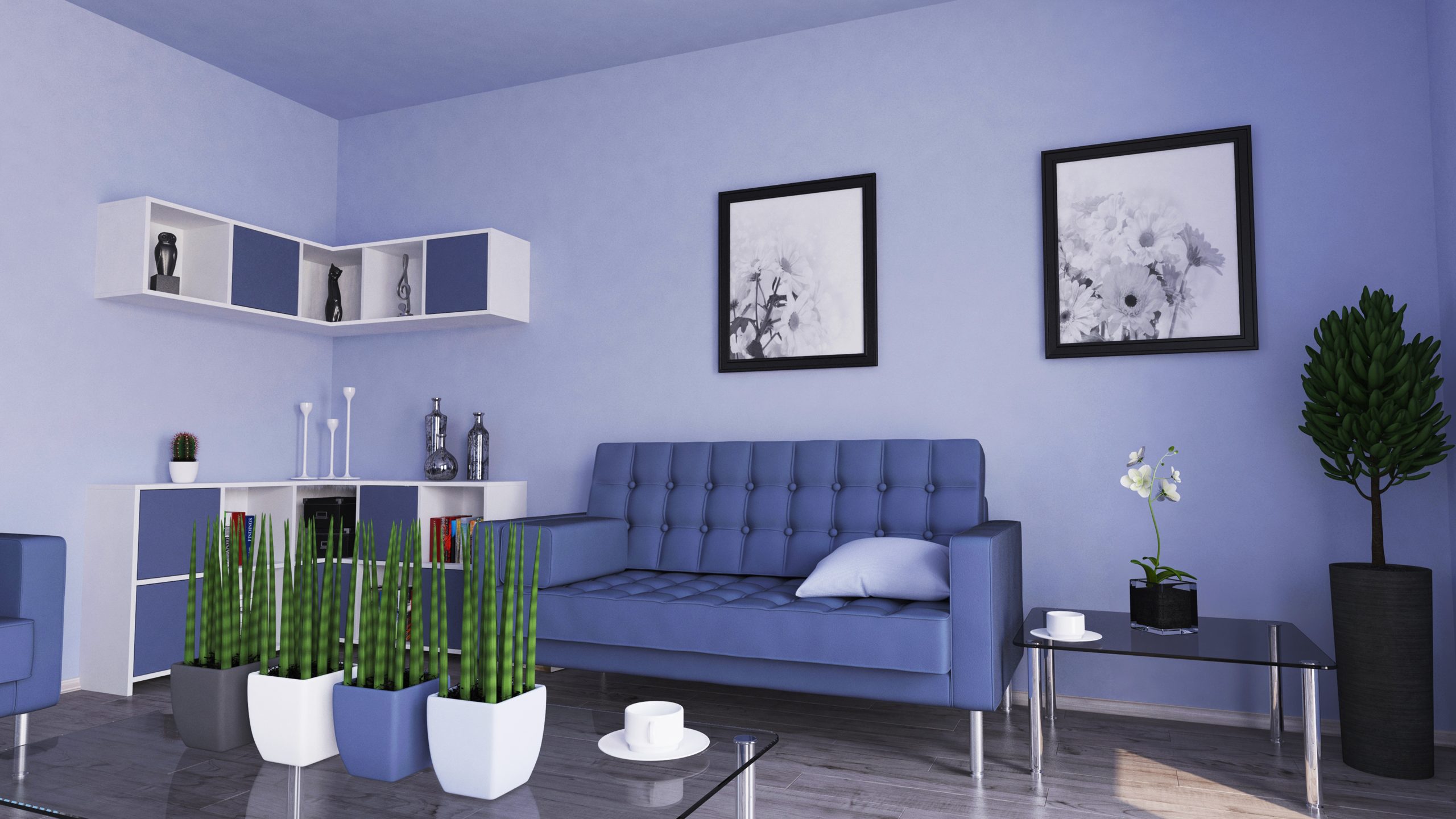
Shades of Blue
Using blue creates a calm and peaceful room. Imagine a living room with dark navy walls, light blue pillows, and a teal rug. This set-up looks polished and welcoming. You can add a piece like an indigo vase or blue art to tie the room together. With blue, it’s important to keep the design balanced.
Charcoal and Grays
Charcoal and gray together make a room look modern and sleek. This style fits well in a simple, contemporary home. Picture a bedroom with light gray walls, dark charcoal bedding, and soft gray curtains. These choices give a refined and calm feeling. Adding metallics or textures can make the room more interesting. This keeps your gray theme beautiful and lasting.
Earthy Tones
Adding earthy tones to your home can turn it into a warm, calm place. Colors like terracotta, warm brown, and sage green make your space feel comfy and grounded. Let’s look at how these nature-inspired colors can make your home look better.
Terracotta and Warm Browns
Terracotta and warm browns bring coziness and a touch of elegance. Terracotta adds a rustic, sophisticated vibe. Warm browns create a stable, comforting feel. These colors make your space welcoming and timeless.
Sage Green and Olives
Sage and olive greens are great for a peaceful, fresh space. Sage green is subtle and elegant, good for any room. Olive green adds depth and interest. These greens make your place calm, like nature, and help you relax.
Bold and Vibrant Colors
Using bold, vibrant colors in your home makes a strong statement. Vibrant accents can change your home’s vibe, making it lively and creative. Inky blue and sunshine yellow are perfect for this. Let’s see how they can make your home more exciting.
Inky Blue
Inky blue is deep and sophisticated. It adds elegance and calmness to any space. It’s great for relaxing areas.
Combining it with light colors like white or gray can keep the room from seeming too dark. This lets the colour scheme feel open and airy.
Sunshine Yellow
Sunshine yellow adds happiness to your home. It’s bright and cheery, perfect for boosting moods on a cloudy day. Using it as a main color or in small decorations brings in warmth and light.
When matched with neutral shades, it ensures the bold and vibrant colors don’t take over. It makes your home warm but balanced.
Calming and Soothing Hues
Your home should feel like a safe space. The right colors on your bedroom walls, living rooms, and study spots can do just that. Pick calming and soothing hues to turn these areas into peaceful escapes. They help relax your mind and lift your spirit, making you feel both calm and clear-headed.
Delicate Pink
Think about using delicate pink on your walls for a touch of peace. This soft color makes rooms, especially bedrooms, feel calm and caring. It has a light warmth that eases your mind, ideal for places you go to chill.
Cloudy Blue
Cloudy blue is also a great option. It’s like bringing the clear sky inside your home. Using cloudy blue in bedrooms or gathering spots brings calmness right away. It makes you feel relaxed and open.
This color comes in pale or muted shades, adding peace and stability to your home. Choosing delicate pink and cloudy blue for your decor helps everyone feel more relaxed. It turns your home into a welcoming place for unwinding your mind and spirit.
Rich and Deep Shades
The charm of rich, deep colors in decorating is irresistible. They turn any room into a sophisticated retreat. Use them wisely on accent walls to make your space welcoming.
Burgundy and Claret
Burgundy and claret make rooms feel luxurious. They make modern furniture stand out beautifully. Painting one wall in these colors adds warmth and richness.
Deep Teal
Deep teal combines calmness with boldness uniquely. It dramatically boosts your interior’s look. On accent walls, it brings calm and a modern flair to your home.
Adding these dark, rich colors to your decor makes rooms eye-catching. Focusing on burgundy, claret, and deep teal creates a stylish, up-to-date environment. It adds depth and personality.
Pastel Perfection
Transform your living space with pastel perfection for a tranquil vibe. These soft colors bring sophistication and calm. They’re perfect for any room, offering a serene and lively feel.
Soft Turquoise
Add soft turquoise to your decor for a calm and fresh feel. It’s great for rooms where you want peace, like bedrooms. This color works well with neutrals or as a bold accent in your home.
Lilac Purple
Bring in lilac purple for a touch of elegance and playfulness. It’s great for spaces needing warmth and tranquility. Lilac purple makes any room welcoming and stylish, ideal for a cozy vibe.
Two-Tone Combinations
Using two-tone combinations changes any room with a striking color mix that suits modern tastes. Think about mint green with navy blue for a cool contrast. It brings depth and interest to your space.
For a minimal look, try white with blush pink. This color combination makes modern furniture look elegant and fresh. Charcoal gray with light teal also creates a sophisticated, calm feel.
Prefer bold? Combine emerald green with deep burgundy. This colour combination stands out in any room. But, use bold colors with neutrals for balance, as experts recommend.
Two-tone combinations let you customize your home. By choosing and pairing colors wisely, you create a contemporary, harmonious setting that shows your style and improves your home.
Whimsical and Playful Schemes
Bring life to your home with whimsical and playful color schemes. They make any room cheerful and inspiring. Use bright pink, ochre, and mustard to create a lively space full of creativity and joy. These colors are great for play areas and places where you want creativity to bloom.
Bright Pink
Bright pink adds fun to any room. Use it on walls, furniture, or decor for a bold look. It makes spaces lively and full of energy, perfect for sparking creativity.
Ochre and Mustard
Ochre and mustard bring warmth and happiness to any space. They mix playfulness with sophistication, suitable for all ages. Add these colors to pillows, rugs, and curtains for a whimsical feel. They create a space where imagination is free to roam.
Classic and Timeless Colors
You can’t go wrong with classic and timeless colors for a long-lasting,es stay popular, outliving short-lived trends. They’re perfect for homes longing for a durable beauty. Benjamin Moore and Dulux lead with colors that have a timeless appeal. Rich or soft tones, they bring stability and sophistication.
Experts say there’s psychology behind these colors’ popularity. Crisp whites, deep charcoals, and muted beiges make spaces calming yet allow for change. By choosing the color of the year from these choices, you get a stylish, lasting update.
These colors are not just enduring. They’re also very adaptable. They let you mix new trends without ruining your space’s overall look. This makes your home remain inviting, whether it’s modern or traditional.
Top Interior Color Schemes for Modern Homes
Exploring top interior color schemes shows how color transforms modern homes. Each palette adds its own special feel, making spaces vibrant. From the calm of neutral colors, the elegance of monochrome, to natural tones’ warmth, picking the right colors is key for design harmony.
Looking ahead to 2026, using these colors will not only make homes look better but work better too. If you love bold colors, inky blue and bright yellow can make any room pop. On the other hand, soft pink and sky blue offer a peaceful escape from daily chaos.
This year, expect to see more rich colors like burgundy and claret, which bring luxury and depth to spaces. Pastel colors, including light turquoise and lilac, add a fun and inviting feel. Using two-tone colors also makes spaces interesting and unified.
In the end, the best colors for modern homes in 2026 are those that suit personal taste and match modern decor. The right choice of colors is essential for creating a home’s unique character and mood. This makes color a key part of modern interior design.
Conclusion
As we look into home decor for 2026, color stands out as a key element. It changes how your home feels. From calming neutral tones to bold, deep colors, each choice shapes your space. These colors mix style and function, making your home feel just right.
Using one color or earthy shades adds depth and personal flair. Light pastels offer elegance, while fun colors spark creativity. These choices help you find top interior looks that are both modern and appealing.
Your home is like a blank canvas, waiting for colors that bring happiness, calm, and comfort. Keep in mind, choosing the right colors changes not only your home’s look but also how you feel there. Let color transform your home into a place that’s both stylish and truly yours.
What are some popular color palette ideas for modern homes in 2026?
Some popular color palette ideas for modern homes in 2026 include earth tones such as taupe and light brown, muted greens like forest green, and rich indigo walls paired with white accents. These palettes create a calming effect and complement various design styles.
How can I incorporate a subtle colour palette into my kitchen?
To incorporate a subtle colour palette into your kitchen, consider using light brown and muted green paint colours. These tones can enhance the natural light and create a warm, inviting atmosphere that works well with wooden furnishings and decor.
What is the significance of a colour palette in interior design?
A colour palette is crucial in interior design as it sets the mood and tone of a space. It can influence how you feel in a room and is essential for creating coherence throughout your home. A well-thought-out palette can enhance the overall design style and harmonize furniture and decor.
Which paint color collections are recommended by Benjamin Moore for modern interiors?
Benjamin Moore offers a variety of paint color collections ideal for modern interiors, including the Color Preview collection, which features bold and vibrant hues, and the Affinity collection, which focuses on harmonious color palettes. Both collections include colours perfect for creating stylish and contemporary spaces.
How can I choose the right room paint color for my home office?
When choosing a room paint color for your home office, opt for calming and inspiring hues. Light brown and muted green can promote focus, while subtle shades of blue can enhance creativity. Experiment with different palettes to find the combination that best suits your work style.
What trends in interior color palettes are expected for 2026?
Trends for 2025 suggest a shift towards more earthy tones and muted colors, focusing on subtle color combinations that create a relaxing ambiance. Expect to see increased use of greens, browns, and soft blues as homeowners seek to connect with nature and create tranquil spaces.
How do I create a minimalist colour palette for my living room?
To create a minimalist colour palette for your living room, focus on neutral shades such as white, taupe, and soft greys. Incorporate subtle color accents like muted green or light brown through furniture and decor to maintain a clean and uncluttered look while adding warmth and depth.
What are some effective palettes for the home that include rich indigo walls?
Effective palettes featuring rich indigo walls can include combinations with white for a fresh contrast, or with earthy tones like light brown and muted green for a more grounded feel. These palettes create a striking focal point while maintaining a sophisticated atmosphere.
How can I use yellow and blue in my colour palette without overwhelming the space?
To use yellow and blue in your colour palette without overwhelming the space, consider using one color as the dominant shade and the other as an accent. For example, a soft blue can serve as the base for walls, while yellow can be introduced through accessories or artwork to add a cheerful touch.