
More than a dozen major paint brands have picked warm, natural tones for 2026. This shows that comfort and craft will be key in your next paint choice. These trends will shape what you see in showrooms and on designer mood boards.
For winter 2026, expect a mix of sophisticated neutrals and deeper, bolder hues. Big names like Benjamin Moore and Sherwin‑Williams say it’s a time for restoration and authenticity. The focus is on wellness, heritage, and a handcrafted feel.
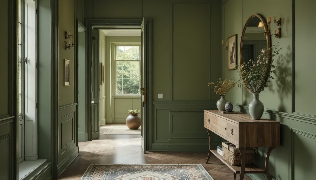
Warm colors like olive greens, terracotta, warm sage, and mahogany are trending. They move interiors away from cool grays and towards nature-inspired schemes. These colors are not just for the 2026 color of the year but for creating comfortable, lasting spaces.
This guide offers tips for South African homes and how winter 2026 trends are influencing homeowners. Discover which colors will define your home and how to use them with confidence.
Why winter 2026 is about warmth, nature and restorative colour

Winter 2026 is all about warmth and calm. We’re moving away from fast trends to colours that last. Brands like Behr and Valspar market colours that boost wellness and healing.
Design is now about craft, heritage, and simple, honest colours. Designers like Arianna Castro and Sara Slade suggest warm colours like olive, terracotta, and bronze. These colours add texture, depth, and subtle tones to designs.
The tool belt generation loves practical and earthy colours. They see greens and warm yellows as everyday neutrals. These colours connect us to nature and ground our spaces.
In South Africa, this trend fits perfectly. Our local materials like timber and stone love warm tones like mahogany and sandstone beige. Our sunny weather and indoor-outdoor living enhance this warmth.
Choosing 2026 colours means pairing warm neutrals with bold accents. Use colour marketing tips from paint brands, but make them your own. This way, your space stays true to you and current.
Greens and nature-inspired hues
Greens are back in a big way for 2026. They bring calm and modern vibes to your home. Brands like Behr and Valspar offer a range of greens, from soft to deep.

Key shades to expect
You’ll see both light and dark greens. Behr’s Hidden Gem and Valspar’s Warm Eucalyptus are top picks. Olive green and warm sage are great for cozy rooms.
Other favorites include pistachio, teal, and weathered greens like Antique Coin and Cactus Valley. These can be bold or subtle, depending on how you use them.
How to use green in your home
Use Hidden Gem or Warm Eucalyptus in bathrooms, nooks, or small rooms for a calming effect. Olive or warm sage works well as a neutral in living areas, kitchens, and bedrooms.
Pair green with natural wood, brass, rattan, and stone for a cohesive look. In South Africa, greens connect indoor spaces with outdoor gardens, perfect for warm light.
- For accents: try olive throw cushions or a painted door in warm sage.
- For impact: drench a powder room in Hidden Gem for a cocooning effect.
- For longevity: select mellow olive green walls that read as neutral over time.
Reddish browns, warm mahogany and earth tones
Brown is back in 2026, but it’s not just any brown. It’s about rich, textured colors. Designers are using reddish browns and earth tones to make rooms feel modern yet cozy. These colors are perfect for South African homes, where natural light and warm materials enhance their beauty.

Why browns are back?
Brown paint is now seen as thoughtful and detailed. Shades like mahogany and auburn add warmth to bedrooms and dining rooms. Warm mahogany can make a space feel cozy without being too much.
Reddish browns look great with different textures. Mix them with cream, blush, natural wood, and brass for a balanced look. Adding small amounts to walls or furniture adds depth. Using them for bigger projects, like cabinetry, makes a room feel special and calm.
Brand examples and signature shades
Turn to well-known brands for your color choices. Benjamin Moore’s Silhouette is a mix of espresso and charcoal, perfect for bold backdrops. Glidden’s Warm Mahogany is a sophisticated, red-brown for dining rooms. Minwax’s Special Walnut is a timeless stain for furniture and woodwork.
- Krylon’s Matte Coffee Bean is great for DIY projects and small tasks.
- Sherwin‑Williams’ Armagnac and Dark Auburn suggest deeper, richer browns for 2026.
- Clark + Kensington’s Hazelnut Crunch and chestnut shades add a modern warmth to designs.
Choosing brown paint means thinking about finish and size. Flat or matte finishes highlight textures, while satin shows off wood grain. Use Silhouette or Special Walnut on furniture to ground a room. Warm Mahogany on cabinets adds a rich, heritage look. Krylon can quickly update trims and accessories, letting you try out trends without a big commitment.
Natured-inspired yellows and ochres
Warm, earthy yellows are big in 2026. Experts say ochre tones are both modern and rooted. They blend into the landscape, not standing out too much.
Warm, earthy yellows to watch
Epernay from C2 Paint is a soft ochre with a French stone vibe. Dutch Boy’s Melodious Ivory is a creamy beige that works well with many styles.
Designers predict bronze ochre and sandstone beige will be big in 2026. Bronze ochre adds strength to any room. Sandstone beige is a warm neutral that makes other colors pop.
Other colors to watch include parchment, flax, buttermilk, and grassy tones like Sonoma Chardonnay. Sherwin‑Williams’ Universal Khaki is a midtone tan with yellow undertones, adding optimism.
Where they work best
- Living rooms: soft ochres like Epernay add heritage and calm.
- Kitchens and corridors: Melodious Ivory is a timeless choice that pairs well with wood and metals.
- Whole-room drench or accents: bronze ochre or sandstone beige work in bright and low light.
In South African homes, these yellows bring in the sun and texture. Use sandstone beige as a base and add ochre accents for warmth and depth.
Jewel tones and surprising purples

Rich purples are becoming the stars of winter 2026. Jewel tones are being chosen for their bold, intimate feel in bedrooms, dining rooms, and home offices. Little Greene’s Adventurer and Graham & Brown’s Divine Damson show the growing love for plum and Aubergine in home decor.
Plums, damsons and aubergines in 2026
Design leaders are leaning towards burgundy and eggplant shades. These colors add warmth and elegance without being too much. Behr, Dunn-Edwards, and Sherwin-Williams are adding plums and violets to their 2026 color trends. Little Greene and Graham & Brown are highlighting deeper shades like Adventurer and Divine Damson.
The forecast includes a wide range of violet shades. You’ll see everything from deep amethysts and plums to lighter mauves and lavenders in textiles, furniture, and paint.
How to balance jewel tones?
Pair jewel tones with natural materials. Wood, stone, and woven textures help balance bold colors, making rooms feel rich but not too much.
- Focus zones: try a feature wall, bar recess, or cabinetry in plum or Aubergine.
- Smaller rooms: fill a small space with dramatic color for a grand feel, but keep paths neutral.
- Offset choices: match jewel tones with sandstone beige, Melodious Ivory, or warm timber finishes.
In South Africa, mixing deep plum accents with timber floors and warm textiles creates a luxurious winter vibe. Thoughtful placement ensures jewel tones remain striking and comfortable over time.
Pink-leaning neutrals and soft clay hues
The 2026 colour trends are leaning towards warmth. Designers and paint brands are choosing muted peach beiges and clay tones. These colours are modern neutrals that add softness without overpowering furniture or art.

Why rosy neutrals are rising
There’s a growing desire for colours that restore calm. Brands like Behr, Dunn-Edwards, and Sherwin‑Williams are focusing on shades like Iced Copper and Gypsum Rose. These colours bring warmth without being too feminine.
Pink-leaning neutrals are calming and grounding. They balance bold choices and support cozy, slow-living spaces.
Practical pairings and spaces
Use soft clay hues as a backdrop or on furniture for subtle warmth. They pair well with brass, cream, and warm woods found in South African homes.
- Living rooms: balance rosy neutrals with olive greens and warm mahogany accents.
- Bedrooms: choose Gypsum Rose or a soft clay for restful walls and layer with natural linens.
- Hallways and joinery: apply Iced Copper for depth without overwhelming traffic areas.
To keep schemes cohesive, add ochres or jewel accents. In South African late-afternoon light, rosy neutrals soften shadows and enhance indigenous wood tones. They’re a great alternative to gray or white.
Sultry reds and statement color directions
Rich reds are back, adding warmth and personality to homes. They’re perfect for cozy corners or bold statements. Brands like Glidden and Silk Road Red show how deep reds anchor cozy interiors in 2026.
Deep red family picks for 2026
Expect a variety from Warm Mahogany to classic Burgundy. Warm Mahogany is great for wood-like elegance on joinery and walls. Silk Road Red brings a mineral touch, inspired by ancient pigments.
Carmine and crimson add a lively touch for accents. Choose a soft crimson for upholstery or a bold carmine for doors. These colors make a statement while feeling natural.
Tips to avoid overwhelming a space
- Use deep red on feature walls, kitchen islands, or dresser fronts, not entire rooms.
- Pair Burgundy or Warm Mahogany with creams like Melodious Ivory or sandstone beige to soften the effect.
- Bring in natural textures — rattan, wicker, warm woods and stone — to balance saturation and add tactile warmth.
- Adjust sheen: flat for large planes, satin or gloss for trims to add depth without extra color weight.
- Consider room orientation and light levels before choosing a deep red for big surfaces; north-facing rooms can handle richer tones.
Soft pastels and icy tones as calming alternatives
Milky pastels are becoming a calm choice against bold colors in 2026. Sherwin‑Williams and others suggest Whispering blues, silvery greens, and muted lavenders. These colors keep spaces calm without feeling too plain.
Choose soft pastels for a color that feels almost neutral. They cut down on visual noise but keep warmth. This makes them perfect for subtle, yet personal, color schemes.
Use milky pastels in bedrooms, bathrooms, and nurseries for a calming feel. Designers are moving towards less saturated colors in 2026. This helps create peaceful spaces that match well with textures and patterns.
When to choose milky pastels
- Choose Whispering blues for calming family bedrooms or guest rooms.
- Apply silvery greens for a soft natural feel with plants and wood.
- Use muted lavenders in small rooms for a subtle depth without overwhelming the space.
Where they perform best
- North-facing rooms look great with milky pastels, paired with brass and woven textiles.
- Pair icy tones with sandstone beige or Melodious Ivory to avoid a cold feel in living areas.
- Layer soft pastels over natural wood floors and rattan furniture for a grounding effect.
Brands like Sherwin‑Williams and Dunn‑Edwards feature lighter lavenders and softer aquas. These shades help create calming interiors that are both current and elegant.
How paint companies and colour of the year picks define the trends?
The 2026 palette is shaped by major paint brands. Benjamin Moore, Sherwin‑Williams, Behr, Valspar, Glidden, and Little Greene lead the way. Their choices guide what you see in showrooms and on mood boards.
These paint companies influence what retailers stock and designers choose. They also shape home renovations across South Africa.
Brand selections shaping the palette conversation
Each brand has its own view. Benjamin Moore picked Silhouette AF‑655, while Sherwin‑Williams chose Universal Khaki with HGTV. Behr selected Hidden Gem and Valspar went with Warm Eucalyptus.
Glidden chose Warm Mahogany, and Little Greene picked Adventurer. These choices help create a common language in color marketing and product development.
Beyond the main picks, Graham & Brown, Dutch Boy, Krylon, and Minwax add more colors. Retailers quickly adopt these tones. This makes it easier for you to find matching finishes and accessories for your room updates.
What paint experts and colour directors are saying
Color directors at Behr, Benjamin Moore, and Sherwin‑Williams see a return to nature. They also note a trend towards warming neutrals. This includes restorative design and experimenting with jewel tones and deep browns.
Trend commentators and interior designers highlight the focus on craft and wellness. This means more olive, mahogany, bronze ochre, and sandstone beige in products. Following paint companies’ picks helps you choose colors that are current, reliable, and in line with broader color marketing shifts.
Practical application tips for South African homes
When picking paint color, think about your local light. Rooms facing north can handle deeper colors. Rooms facing south do well with warm colors like ochres or sandstone beige.
Use warm eucalyptus or universal khaki for a calming feel. This can make a room feel soothing and restorative.
Choosing colours for local light and materials
Test paint samples on several walls and see how they look at different times. Natural wood and stone change how colors appear. Place swatches near timber or floor tiles to see the effect.
For north light, try richer shades like warm eucalyptus. For softer light, choose warm neutrals like universal khaki.
Match finishes to the room’s function. Use matte for main walls to hide imperfections. Choose satin for trim to catch light and resist scuffs.
For joinery, a slightly higher sheen makes colors look crisp against natural wood.
Colour-drenching, accents and finishes
Colour-drenching is great in small spaces like reading nooks or bathrooms. Cover walls, ceiling, and trim in a single color to deepen the mood. Use bold colors for feature walls or built-in joinery for visual impact.
- Use warm mahogany or terracotta for dining rooms to encourage a cocooning winter mood.
- Pair woven textiles, indigenous timbers, and brass hardware to echo the 2026 color trends.
- Try Krylon’s Matte Coffee Bean spray for quick furniture updates and Minwax Special Walnut to stain wood elements for a cohesive finish.
Balance accents by repeating a color in cushions, art frames, or small accessories. Keep foundational walls in warm neutrals like universal khaki or Melodious Ivory. This makes bold accents stand out without clashing.
Adjust sheen to add depth to deep tones and maintain harmony across finishes.
Conclusion
When planning updates for winter 2026, it’s clear that nature-inspired colors are in. These colors bring warmth and timeless beauty. The palette for 2026 includes olive greens, mahogany, ochres, and beiges. These options work well with South African light and local materials.
This season’s interior paint colors offer soothing neutrals and bold jewel and earth tones. Use these trends as inspiration, not a strict guide. Mix deep colors, accents, and textures to create cozy, curated spaces.
Choose colors that are practical and true to your style. Opt for restorative greens, reddish browns, soft neutrals, or milky pastels. Aim for a balanced look that feels timeless yet bold.